In this blog, I want to walk you through our monthly executive summaries. These are the written white label reports you receive every month, detailing the progress of your campaign. We’ve made our monthly executive summaries informative and easy for end clients to understand, but this entry serves as your guide to understanding it more thoroughly.
The E-Mail Summary
When we send your monthly executive report, we include a personalized email message showing the highlights of your report. This is divided into three parts:
1. the search engine report summary, which shows highlights of your targeted keywords and additional keywords you are ranking for in the optimization process;
2. the web visitor statistics, which shows how many visitors you had and what percentage of these visitors are relevant traffic;
3. and the action plan, where we tell you which areas of your campaign we will focus on for the following month.
The email contains a PDF attachment – your more comprehensive monthly executive summary. This contains your logo and the name of the campaign. Let’s go through the parts one by one.
Search Engine Position Report
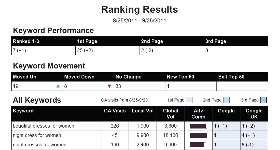
This section contains information about the performance of your targeted keywords. The first two tables contain summaries of your movement and placement, and the third table contains detailed information on each search term or phrase. On top of these, you will find the period covered by your report – in this case, from August 25 to September 25, 2011.
• Keyword Performance
This shows how many keywords you’ve ranked for on SERPs based on where your site appears. It also reveals the movement of the figures compared to the previous month’s performance. In the example above, the client ranks between 1-3 for 7 keywords, gaining one more high ranking from the previous month. You will also see that there are two keywords less ranking for the second page, because the client ranked for those keywords on the first page, bringing up their total to 25.
• Keyword Movement
This table shows a summary of your keyword movements. It reveals how many terms moved up, moved down, maintained their position, entered the top 50 rankings, and exited the top 50.
• All Keywords
This shows detailed information on each keyword you are targeting for the campaign. The first column shows how many Google Analytics visits (GA visits) you’ve received for that keyword. Next, you will find the local (Local Vol) and global volume (Global Vol) of visitors you’ve received in the past month. Next is a bar showing how strong your keyword is based on Google Adwords competition (Adv Comp). The last two columns reveal your ranking on Google US and UK. The rankings are color-coded so you can easily see how many keywords you rank for on the first page, second and third pages, etc.
Web Visitor Statistics
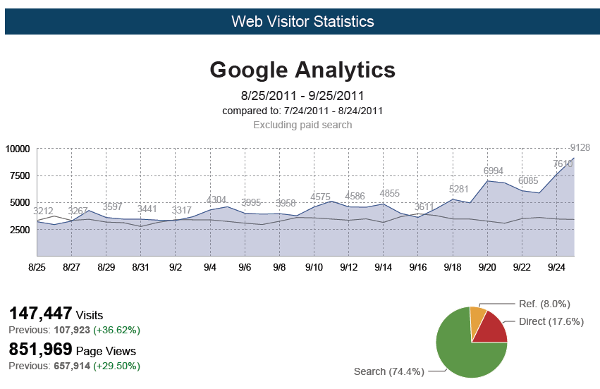
The next section shows visitor data from Google Analytics. You will see a graph detailing your organic traffic for that given period, and a comparison from your performance the previous month. A summary of your total visits is also included, showing you how many people visit your site. The number of page views you received appears right below it, and this number shows you how many times your inner pages have been viewed. Getting a higher number means you receive more relevant traffic. The pie chart shows the traffic origin. In this example, almost 75% of the traffic came from search engines. The two other sources reflected on the chart are direct link visitors and those who came from site referrals.
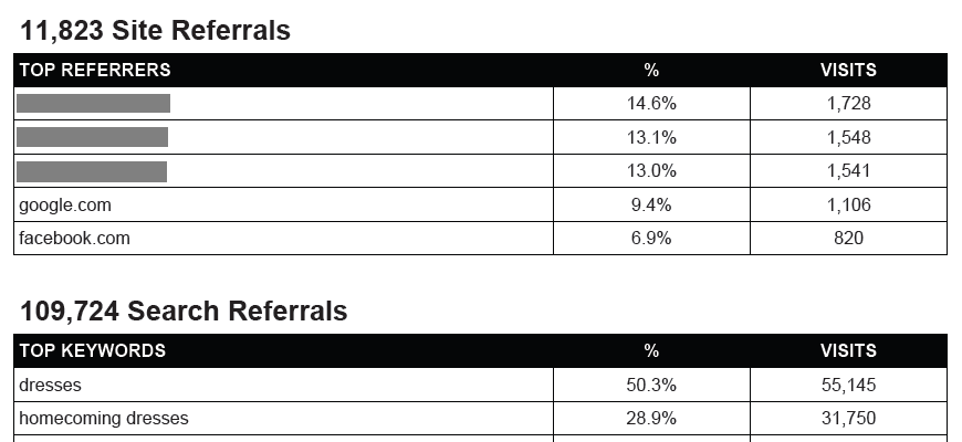
The lower portion shows tables with more detailed information on your traffic sources. The first table shows the total number of site referrals you received, the list of top sites where visitors click your link, and how many visits you received from each site. The second table shows the number of visits you receive from search engines. The first column shows your list of your top keywords. The second column shows the percentage of traffic that keyword contributes to your site, while the last column shows the exact number of visits.
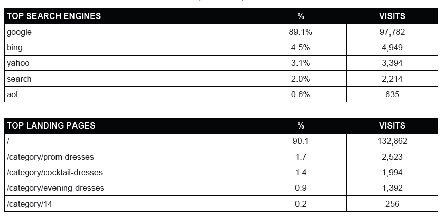
The third table shows which search engines deliver the most traffic to your site, and how many visits you receive from each. In this example, Google delivers 89.1% of the site’s traffic, leading almost 98,000 visitors to the site. The final table on this section is shows your site’s top pages, and how many visits each page received for that period.
Web Visitor – Engagement Report
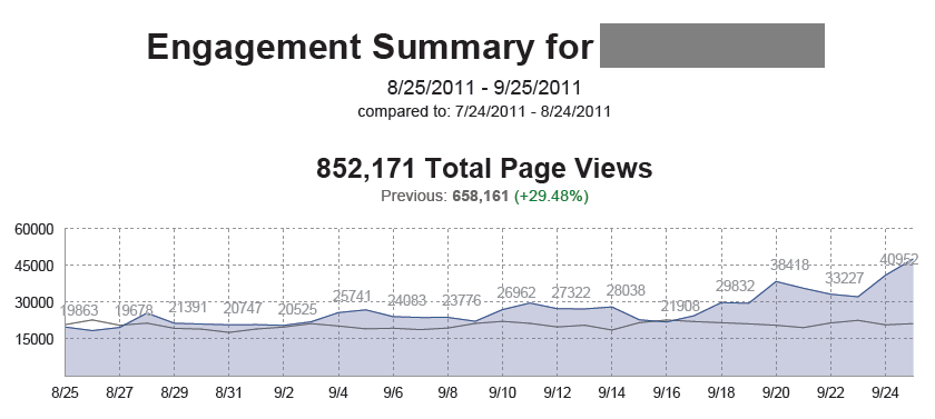
This section features a line graph illustrating your total page views for that particular month. The number of page views you receive are important because this is your relevant traffic. These are the visitors who take time to browse the pages of the site and seek products and services. The current month’s page views (in blue) are compared with the ones from the previous month (in gray). In this example, you can see a 29.48% rise in total page views.
Web Visitor Statistics – Top Keywords
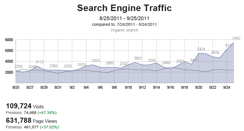
The final section of your report shows details on your search engine traffic. You will see the summary of search engine traffic you received for that period, together with a line graph detailing the number of visitors you received every day for the entire month. You will also see a summary of your visits and page views below. In this example, the number of visits rose over 47%, while the amount of relevant traffic rose by over 37%.
Below this section is one last table showing your top 100 keywords. The second column on this table shows the percentage of traffic you receive from that keyword, and the third column shows the exact number of visits you’ve received for each keyword that month.
I hope this guide helped you understand the parts of your report. You can have your clients request reports through your white label dashboard. They can also see and view live rankings by logging into their dashboard.
Contact your account manager if you have any questions, or if you need assistance with our research and reporting services.

