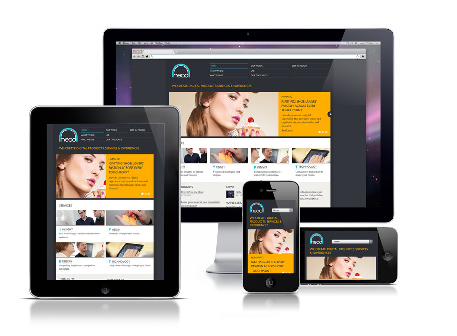
Your target audience is quickly shifting towards mobile. A study from Nielsen released just last month showed that last year, 53% of Americans were using smartphones – 53% for shopping, 53% for banking and finance, and 84% for search and navigation. Mobile has brought the U.S. $6.7 billion in revenue, and this figure is expected to rise to $31 billion in the next three years. If you’re not building mobile-optimized websites yet, you’re missing this huge opportunity.
 Designing for Multiple Platforms
What makes designing for multiple platforms difficult is consistency. Your design needs to be consistent without affecting usability and branding. Since different devices (smartphones, desktop PCs, feature phones, etc.) and platforms (iOS, Android, Windows, etc.) have different capabilities when reading code, some of your designs may become distorted when rendered onto each device.
Responsive design provides a solution to these rendering issues. You can slice your design into blocks, which you can easily rearrange depending on what device and what platform you are using. Responsive web design mainly uses HTML and applies CSS only to decide how to render a specific element of a page. This allows elements of your web design to be displayed properly regardless of your chosen device.
Tips on Designing for Mobile
Before building your mobile-optimized website, you need to do a few things:
-
Check your mobile audience.
Find out how much of your audience uses mobile, and learn what the most popular platform is among these users. This will help you decide how much of mobile to integrate into your design. IF you have a large audience and you find that there’s no majority count on what platform they use, you might want to incorporate different elements to accommodate all the devices your site may reach.Analyzing your mobile audience also helps you decide how much you can accommodate without sacrificing your original vision for your own or your client’s website. You will have to resize images, consider loading time, and envision the layout for each platform. These may require you to sacrifice some elements of your website’s desktop version.
-
Analyze if responsive web design is best for you.
Responsive web design works for most websites with static content. Using this kind of design may not be the best idea if you have an image-heavy website, or if you have dynamic websites like ecommerce pages that change content regularly. Think of what you want your website to look like, the time frame you need to get your website live (responsive design takes longer to finish because you need to make sure the elements of your page stack properly no matter what device you use), and whether you will be changing different elements regularly.If responsive web design is not the best choice for you, you may need to create a separate HTML version for mobile. Don’ t worry about algorithms – Google’s crawlers can identify and sort out the desktop and mobile versions and choose the version to display even if you put them together. Put the Vary HTTP header on your page if you want to serve different HTML versions under the same URL. If you use separate URLs for desktop and mobile, remember to use the rel=”alternate” tag on your desktop version and rel=”canonical” tag for your mobile HTML. This will help crawlers identify and index both properly.
-
Check Google’s Guidelines on optimizing for mobile.
Google provides a set of guidelines that will help your site become both user and search engine-friendly. Make sure to check and follow these guidelines before starting your project. These tips are useful for creating a basic template you can customize for your own or your client’s website. We all know following Google’s guidelines helps having all your website pages indexed properly and ranked accordingly, which is why you should check these guidelines before beginning your project.
-
Get the best web design services.
Building mobile-optimized web design for your clients can get complicated once the projects start coming in. You will need to sort out which clients prefer responsive web design, what look and feel they want for the desktop and mobile versions, and what kind of optimization they will be needing for each. As our partner, you will have access to our talented team of designers, developers and marketing specialists to help build your brand and create websites that represent you accurately no matter what device your audience is on.
Talk to your account manager today to find out more about mobile-optimized web design. Sign up for a free account if you’re not yet our partner and check out our full line-up of services on your free dashboard. Check back soon for more tips and updates!
 Designing for Multiple Platforms


