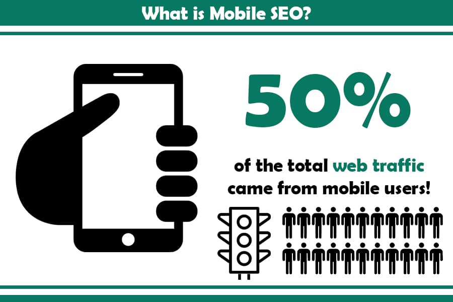
Almost half of the world’s web traffic comes via mobile searches. If you are working in the digital marketing niche and don’t have a mobile SEO strategy, you are missing most of your potential users. Besides putting in efforts in the digital marketing world, you also have to think smart in terms of how you apply SEO strategies for mobiles.
In this guide, we will have a deeper look into the viable mobile SEO strategies you can use, and share insights on how and when to use them right so as to scale your business.
Mobile SEO through Stats and Facts
Mobile SEO provides search engine optimization of websites with a unique viewing on smartphones and tablets. The main goal is to achieve optimized content with a better ranking. Such an effort will drastically improve both your Search Engine Results Pages (SERPs) rankings and your site’s organic traffic.
The user location, the device’s operating system, and the screen size will all impact the quality of your mobile SEO. With it, customers will load the mobile site version quickly and enjoy a flawless experience on their smartphones.
Several search engines exist, but 95% of the mobile SEO is done on Google as the leading business scaler. What’s more, Google makes for 58% of mobile users doing online searches. And if that’s not enough, there’s the fact that 30% of all mobile searches are based on location, which then gives local SEO strategies an additional boost in effect.
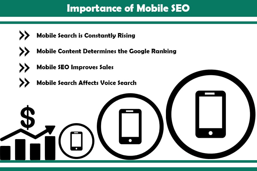
Importance of Mobile SEO

Without a doubt, Mobile SEO is the future of the digital marketing niche, which is why Google has decided to rebuild its entire algorithm and direct it toward applicable mobile SEO strategies.
Here are the most common reasons why we recommend switching to mobile optimization SEO.
Mobile Search is Constantly Rising
Mobile searches have surpassed desktop and tablet searches, and for now, this trend continues. That means that if you are in the digital marketing niche, you need to improve mobile SEO to target your customers more efficiently. This can be easily seen in the fact that around 51% of mobile users have found their desired product or service on their phone rather than a desktop PC or a laptop.
Mobile Content Determines the Google Ranking
Google switched to a mobile-first index, which means it is using a responsive web design and implements dynamic serving so as to improve the overall search engine ranking. That said, if you don’t use mobile SEO, you will have the risk of poorly ranked content.
Mobile SEO Improves Sales and Brings New Customers
Take into consideration the fact that more than 40% of people use mobile devices to research products and complete the whole shopping journey.
Google research has clearly stated the following:
- Over two years, the mobile search, including the word “best,” has grown by 80%
- Users care about site speed, and it can seriously impact your business and sale
- Product review searches via mobile over two years have increased by 35%
- People prefer to watch video reviews via mobile searches
All in all, mobile SEO will keep old customers satisfied and help you get more new ones, mainly by offering them a better site experience than before.
Mobile Search Affects Voice Search
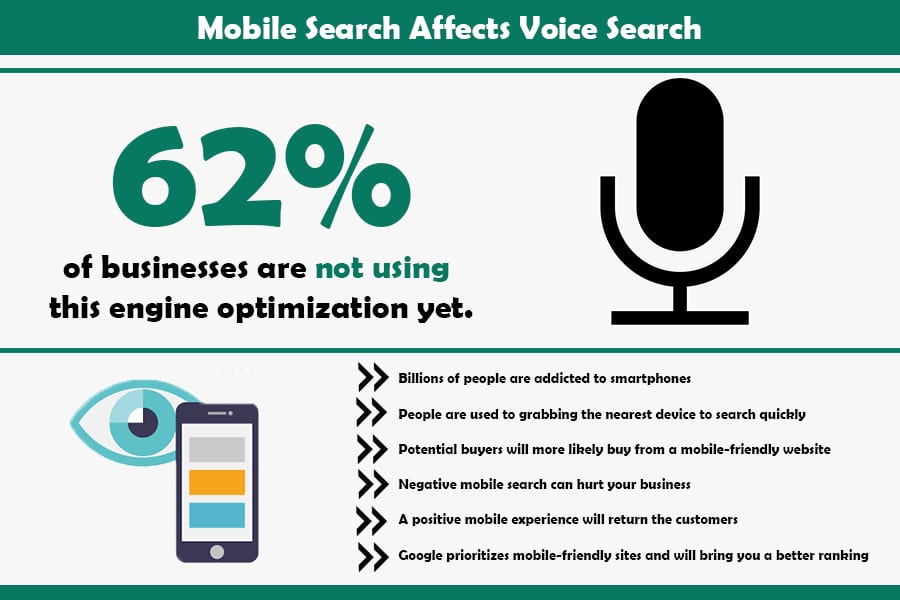
Voice search is becoming very popular in mobile search. As the “present” and “future” of mobile searches, mobile optimization is crucial for improving the SEO strategy.
Recently, voice search has been used with tablets and smartphones although many use it on devices like Amazon’s Echo. Overall, you’ll provide your customers with well-optimized content from any device. Consider that roughly 66% of businesses are not using this engine optimization yet, so think of mobile SEO as a competitive advantage.
Firstly, check your mobile traffic because it will only make sense if your business gets a lot of daily mobile traffic. However, as the daily traffic increases, you’ll realize it’s wise to switch to mobile SEO at some point in your progress.
Now, let’s summarize why mobile SEO is crucial:
- Billions of people are addicted to smartphones
- People are used to grabbing the nearest device to search quickly
- Potential buyers will more likely buy from a mobile-friendly website
- Negative mobile search can hurt your business
- A positive mobile experience will keep the customers returning
- Google prioritizes mobile-friendly sites and will bring you a better ranking
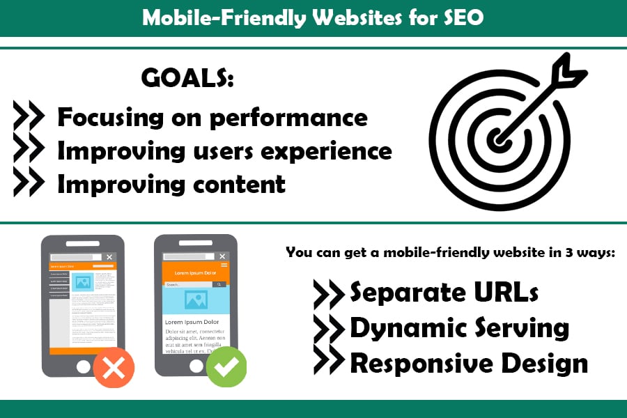
Mobile-Friendly Websites for SEO
Mobile SEO strategy includes search engine optimization on tablets and smartphones. There is a difference between mobile SEO and desktop SEO, but their goals are the same – to reach customers and audiences and turn them into potential buyers.
Desktop SEO can work for mobile SEO, however, it is in a different form.
The common goals of mobile-friendly SEO sites include:
- Focusing on performance
- Improving users experience
- Improving content
The difference is that desktop SEO focuses on the general public, while mobile SEO is more of a local SEO since it has a local focus. Depending on what device you use and the location at hand, you can get different search results.
Because of this, it is always smart to check what Google offers via mobile.
Have you ever googled something via mobile and then got sponsored content of the same content everywhere across the internet? It is Google’s algorithm that provides you with rich results and structured data when using a smartphone.
You can get a mobile-friendly website in 3 ways via Google:
- Separate URLs
- Dynamic serving
- Responsive design
Before we move on and get an idea in your head, here is the basic differentiation:
Separate URLs
This configuration allows detecting the user’s device and provides the optimized URL for that specific device. In other words, except for the desktop version, users can enjoy a mobile version of the same site. This version is known as the “m” configuration. To achieve this, separate URLs are served on mobile and desktop versions.
Managing URLs separation can get hectic since you will have to use the following annotations:
- rel= “alternate” tag on the desktop version to get to the analog mobile URL
- rel= “canonical” tag on the mobile version to get to the analog desktop URL.
Since this is a difficult task, Google does not recommend going forward with this configuration.
Dynamic Serving
Dynamic serving stands for different HTML/CSS versions for both mobile and desktop, while the URL doesn’t change. This means that the servers detect the user device and the corresponding user agent presents it. However, this detection has its flaws and can often lead to errors and display wrong website versions.
Because of its flaws and errors, dynamic serving is also not the solution for mobile site optimization.
Responsive Design
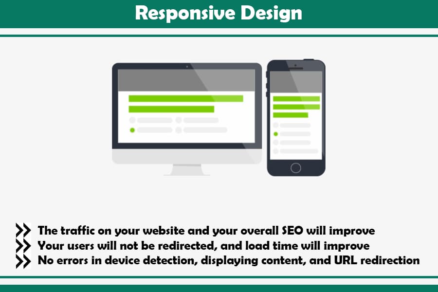
This is a highly recommended way for search engine optimization mobile. It works in a way that shows the same HTML code on the same URL, despite the device used. Responsive design means that the content and code correspond to the different screen sizes.
This is why Google recommends mobile-friendly websites with responsive web designs:
- The traffic on your website and your overall SEO will improve
- Your users will not be redirected, and load time will improve
- No errors in device detection, displaying content, and URL redirection
How to Check Mobile Friendly Websites?
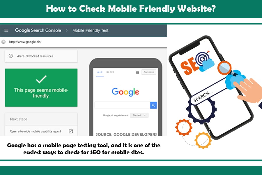
Before making any changes to improve your mobile SEO strategy, check if your site is already mobile-friendly. The good news is that you don’t have to load each page from your smartphone to see if your site has mobile SEO optimization.
Google has a mobile page testing tool, and it is one of the easiest ways to check for SEO for mobile sites. You have to paste the URL of the page you want to test, click “Test URL” and you will get the results in no time.
In case you use Google Search Console, you will test your website even simpler. The results will show if your website is mobile-friendly and get separate URL categories according to their issues. After you complete your analysis, you will have a better idea of your mobile site optimization strategy.
Another piece of advice is to check “crawling” and see how search engines index your content. Your content won’t appear in SERPs if you can’t “crawl” your site. However, some tools can check website crawl.
You must log in to your Google Search Console account, select Crawl, and then select Crawl Errors and click on your smartphone. If there are some errors, a graph will appear on your screen to indicate them.
How to Track Mobile Traffic in Google Analytics?
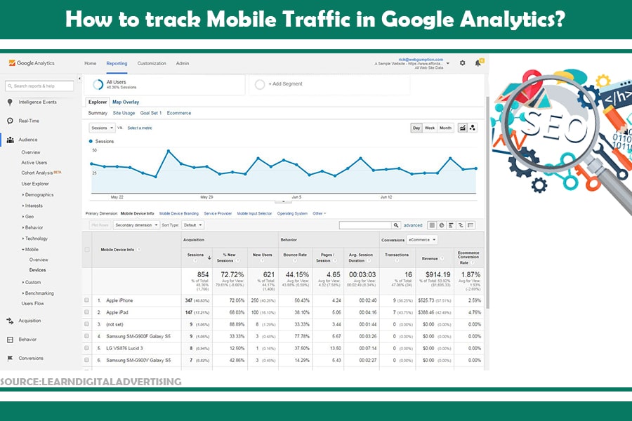
Wondering how to check the mobile traffic your site gets? Use Google Analytics, log in and navigate to the audience, and then select mobile. You will get percentage numbers of website traffic using tablets, desktops, and mobile devices.
You can also explore website traffic data for different periods using the onscreen date selector.
Considering the effectiveness of mobile SEO optimization, you will most likely notice an increased number of mobile devices.
It makes sense to create a mobile-friendly site and start practicing mobile SEO with all the previous data.
Optimizing for Mobile SEO: Best Content Tips

Content optimization is crucial to keep potential customers and buyers on your website. Besides page speed and accessible website, optimized content is the third most essential SEO ranking factor.
That is why it is vital to improve mobile site SEO with an excellent content strategy.
To achieve this goal, you will need to:
- Have appealing headlines that attract the readers
- Include LSI (Latent Semantic Indexing) keywords
- Optimize the keyword intent
- Include inbound links
- Make in-depth content with over 2,000 words
However, there are some twists between mobile and desktop keyword research.
Optimizing Titles and Descriptions
Meta titles and meta descriptions are strongly required for desktop search since they provide information to Google and searches about the page and help in the rankings on Google.
However, you cannot see the entire meta title or description on mobile because of the screen’s size.
Knowing this, you should put everything necessary in the title and tell readers what they should expect from the content. The good news is that meta descriptions have gotten longer, which gives the opportunity to impress both desktop and mobile users.
Social Media and Mobile Website SEO
If you are in the digital marketing world, you must make a correlation between search ranking on Google and social media.
Mobile devices are considered extensions of people, and most of the time spent on social media is done via mobile devices. Therefore, never ignore and underestimate the impact of social media in the process of optimization.
The easiest way to achieve this is to share your content with the social sharing buttons. If your goal is to target mobile devices, include the sharing button for messaging platforms like WhatsApp and Facebook Messenger.
Technical SEO for Mobile Websites
Having an SEO-friendly mobile site is not an easy job to accomplish or manage. Even if you have a mobile-friendly website, you have to take care of the technical SEO and fix all existing issues.
First off, you need to have a general sitemap that will allow crawling your site more effectively. Some SEOs and plugins automatically create site maps, for example, All in One SEO. If you are not using this toolkit, you can use XML Sitemaps and create a free sitemap.
Additionally, you should secure your website using HTTPS since unsecured websites can be explicitly flagged, and no one wants to visit untrusted sites, be it on mobile or otherwise.
To check security issues that affect the mobile SEO strategy, you can use SEMrush.
Content Hierarchy
Another important thing is to use header tags to optimize and highlight the content hierarchy. This way, Google will know the most important content of the page, and more than that, readers will enjoy a hierarchy of content. The main heading is an H1, while other headings will be H2 and subheadings – H3. Besides hierarchy, headings are crucial not to exhaust your visitors and readers. To boost your SEO efforts, consider using a relevant keyword in either or all of these.
Additional Tips on Technical SEO
Google also recommends using schema markup to determine what kind of content and amount of it you have on your site. You can do this using Google Search Console by following the steps.
There are many similar URLs, and sometimes you can find the same products on multiple websites. Make sure you specify canonical URLs and don’t harm your websites. This will give information to Google on which site is the original, and that is crucial for mobile SEO rankings.
Google aims for accelerated mobile pages (AMP) that are accepted as a web standard with mobile-friendly SEO, fast loading, and mobile SEO strategy. Therefore, even if you’re not ready yet, set up AMP on your website because it is becoming a web standard.
Eventually, AMP will become the main criteria and web standard for Google rankings, and not having it could hurt your mobile SEO ranking.
Monitor mobile SEO, research, learn all new updates and read blogs to maximize your website optimization.
FAQ
Why is mobile SEO important?
Mobile optimization aims for satisfied potential buyers that visit your website via mobile devices. The site’s speed, structure, and design can improve with mobile SEO. Other goals are to provide a safe journey and re-visits to the same site.
Is SEO different for mobile?
Yes, mainly because mobile SEO considers the location of the user, the operating system on the device used, and the size of the screen.
What are the characteristics of mobile SEO?
SEO mobile websites provide site speed (the loading time of the website is faster), and user experiences such as viewing, agility, navigation, usage pattern, fidelity, and page size.
How can I improve my mobile website?
Your mobile-friendly website can drastically improve by improving the site speed, making it a joyful experience, having a responsive site, using structured data, not using too many redirects, verifying mobile-friendliness, choosing the correct viewport, not blocking HTML, Javascript, and CSS code and notifying Google about the website.
Does Google prefer responsive websites?
Google aims for accessible and valuable content for users. The algorithm tends to rank the sites that are user-friendly and responsive. Therefore, mobile SEO websites with responsive web designs are more likely to rank better on Google.
What’s the difference between SEO and SERP?
SEO and SERP are closely related, although they seem similar to beginners in the digital marketing niche. SEO means Search Engine Optimisation, while SERP means Search Engine Results Page.
Using Mobile SEO: The Verdict
Now that you have a good fund in the knowledge of mobile search engine optimization, it is time to put your skills to practice. If you are looking for a way that improves your business strategy and objectives, especially on a local level, mobile SEO is your ultimate tool to trust.
Mobile SEOs are focused on implementing a strong SEO strategy and creating mobile-friendly websites. And since the number of mobile searches is on the rise, it is expected that businesses, too, will follow up on this mobile trend. More traffic, revisits, and retained visitors are some of the perks of using mobile SEO as part of your strategy.
After all, first organic listings on mobiles earn 27.7% of clicks, whereas desktop listings only boast 19.3% of clicks.