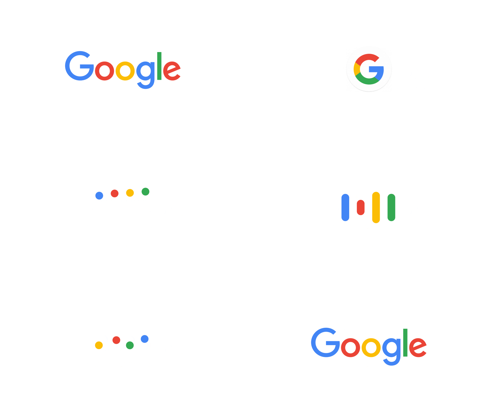
Google unveiled the new look of its iconic logo in an effort to better reflect the new capabilities and identity of the search engine. The change is part of a much larger rebranding effort by the company that includes updates in Search and Now Card Visuals.
Google representatives explain that the logo change is a move that allows the company a chance to better mirror the modern state of the internet as a whole. More and more users are accessing the Internet through multiple channels and platforms, mobile being the most prominent of all.
The Anatomy of the Google Logo
The logo is made up of three elements: the Google logotype, the Dots, and the G. The first is a sans serif logotype that adopts neutral consistency, but retains the multi-color sequence of the prior logos. Dots is a dynamic version of the Google logotype for interactive transitions that represent a full range of expressions. The G is a compact multi-color version that works in small contexts such as the tab, and uses increased visual weight to stand out.
The new logo has been carefully designed to look pixel perfect regardless of the device users view it from. The intricate serifs and large file size of the old logo requires a text-based approximation for low bandwidth connections, resulting in an awkward screen fit on certain occasions.
This isn’t the first time Google made changes to its look, the latest prior change was as recent as 2013. This latest rebranding effort, however, is more drastic and comprehensive than all of the past incarnations of the company.
Googling Forward
In addition to the new look, Google will also be updating the look of its mobile search results page, and Now cards to better reflect the new visual language. The Now cards, for example, will be divided by category to allow users to find their desired content faster. The cards will also shift to the most relevant pieces of information as the day wears on.
Users will be able to see the new logo, icon, and animated dots across all devices, including Google search on mobile and the Google App. Google designers hope that the simplicity of the new design will be able to give users a better search experience.
Just like Google, your company might be due for a logo update. Get in touch with one of our project managers today and find out how we SEOReseller can help.


