Optimizing all the elements of your online marketing campaign for mobile prepares your campaign for smooth multi-platform integration. As more of your target clients focus on integrated marketing efforts, it’s important to ensure you’re reaching audiences across different devices. Email is one of the easiest to optimize for mobile, and it also happens to be one of the most effective lead generation and nurturing. Today I want to go over a few tips on optimizing your content marketing strategy for email marketing.
Maintain Your Branding
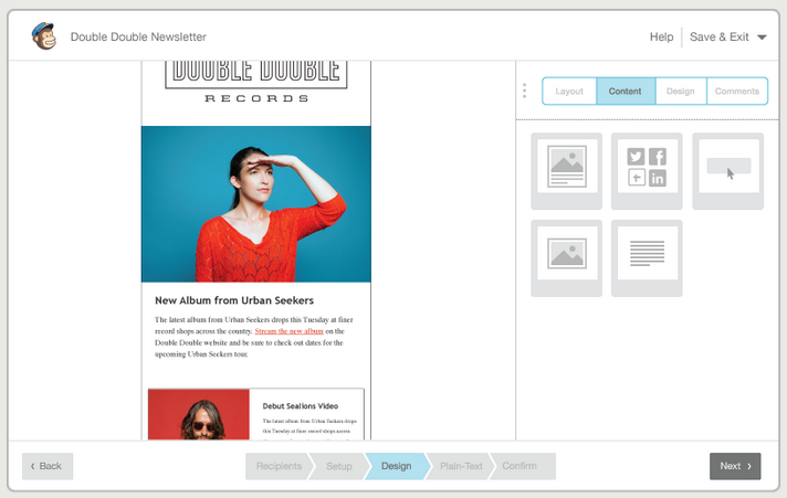
Maintaining the look, feel and message of your brand in your newsletters and other email correspondences is important in promoting brand recall and introducing your personality to your target audience. We do this for you by:
- Using responsive design to maintain the look and feel of your messages
- Optimizing the size of your logo to fit mobile browsers while still looking good and prominent in desktop email clients
- Keeping your message short and to the point (if you’ll be using the same message for desktop and mobile subscribers) or creating a brief but equally powerful version of your full-length message (if you have a separate mailing list for mobile subscribers)
- Consulting your entire organization about proper representation in every step of the way
Consider Mobile Readability and Functionality
Making content easy for mobile readers requires you to think about the length of your content and, subsequently, the best way to present your message given the length constraint. Messages that are short, concise, and extremely catchy will be most appropriate for email campaigns that target mobile users.
Functionality is also important when designing your emails. Using adequately sized buttons for your action items is important in ensuring ease of access, whether on a cellphone with a keypad or on touchscreen devices. These are only some of the things our designers consider when creating your email campaign.

Test Your Emails on Different Devices
The tricky thing about mobile marketing is that you’re not just designing for one kind of mobile device – you’re designing for a whole variety. You need to make your message work on all these devices, ensuring they display properly on different platforms and they look presentable even at the slightest size and screen resolution change.
We check your code to ensure that it is compatible with iOS, Android, and other platforms’ email clients. We also optimize images accordingly – there’s no need to use hi-res photos for handheld devices.
Optimize Your Landing Pages
Your email marketing campaign doesn’t end when your target audience opens the email – it goes on until they click on your call to action button. Make sure the landing page you lead them to is optimized for mobile conversions. This is the final part before they decide to complete your conversion goal for the email marketing campaign, which is why we ensure that your landing pages are compelling, mobile-friendly, and functional across different devices as well.
Talk to your account manager today for more tips on optimizing your email marketing campaigns for mobile. If you’re not yet our partner, sign up today and enjoy the benefits of our complete and advanced SEO suite. Keep checking back for more updates!


